Wednesday, 25 March 2015

MERCHANDISE FOR WEBSITE


This is the different merchandise clothing pieces I have made for the shop feature of the website, I just found images online of plain tops that I could put my own designs onto and then added these designs using Photoshop. I decided to cut out some of the graffiti from some of the photoshoots and add them onto plain t shirts and added the lyrics to one because I thought that would be cool and the fans could relate I also added just the artists name tomi. I then decided to have two crop tops of different style in the merchandise too as our target audience would follow new fashion trends and one that is very popular is crop tops. I also decided to create two different jumpers, one of them being quite a plain one with simply just her name written on it and the other being more bold by the whole jumper being an image of Tomi (gabi) printed onto the jumper.

FINAL DIGIPAK


This is my final digipak, I am overall really please with how it went because I think it really showed what I wanted to show in terms of her versatility with the cut up images. I decided to stay with the graffiti theme as that is recurring in our music video and i thought that this would make them link well.

Tuesday, 24 March 2015

FINAL DIGIPAK COVER

This is my final cover for my digipak, I decided that instead of doing what chris brown did with his cover to take inspiration from it and make it my own, I decided that I wanted more of a sense of star image in my cover, i initially was going to put a big image of Tomi in the middle on top of the collage like chris browns fame album, I instead decided to keep it all the collage accept have one main image in the middle that is the biggest image of them all where you can see her full face unlike before when all images were of half her face,
I decided to add the parental advisory label on it because i feel as though Tomi is of the genre in which some content may be slightly explicit, however this will mean only one or two songs unlike a rap album that every song would contain explicit content.

FACEBOOK AND TWITTER

These are the individual facebook and twitter i have made for our artist 'Tomi' so that fans can access her on all media platforms. 


HOME PAGE WEBSITE

This is my finished home page,
I really liked the simplicity of the page and thought that it looked really effective with the accordion style image collage at the top.You can also access all the other pages at the top too and you can also see all the social media links above to all the main social networks. (my computer was being slow and therefore all the images did not load.
 When you scroll down you can see the latest news that you would see on the news page. and on the side you can see the different soundcloud clips from the artists and listen to the songs straight from the website.


This is the bottom of the page where you can click to view more news, I have also inserted our logo as a record company and put the copyright symbol so that it seems legit.
                                                                         

6TH DRAFT DIGIPAK


This is the 5th draft for my digipak cover, I really liked this and thought that it was the most effective in collage style that I am trying out, however when asking my peers for feedback they thought that there were too many images collaged in to one and it was too overwhelming. I inserted 13 images they said it would look better with just 6. I'm going to take this on and try this one more time and hopefully it will work better. I also was told that it might be better if the collage was just the background and their was a big image of Tomi (Gabi) in the middle, I am also going to try that out as when I searched up album covers with collages on the only one I seemed to find was Chris Browns fame, although it is not of the same genre, I still think it is effective as although there is a collage it still focuses on him by having the main image in big at the front.

Saturday, 21 March 2015

DIGIPAK EXPERIMENT

I was looking at my website and took a picture on my snapchat to send to my friend to see what they thought, when sending the picture I noticed a part of the photo collage that I really liked and thought it would be more successful for the digipak compared to the other drafts of the collage like ideas. I decided that instead of making sure each image was of her face, to make it more random. When I saw this on my snapchat i decided to draw around it and write TOMI in the middle as i would for the digipak as a almost sketch of what i want it to look like I hope to recreate this more collage like cover. I also want to look at other artists that have collaged on their album cover to look at the different ways that I could go about it.

Friday, 20 March 2015

5TH DRAFT

When watching my music video I realised that the star had many different looks and personalities to her, I decided that this cutting up of images almost shows that she is so versatile. I therefore have decided to do another one of these experiments however this time I decided to include her whole body to show the different looks that she is. The first one shows that she can be almost 'Rock' like and fierce. The second image shows her urban side with her different fashion and hairstyle. The third image shoes her more casual tomboy side. And the last image shows her more glamorous side. As well as connoting this, this cover also matches the style of the website, however i am not fond of the images i used to create this cover of this digipak. I would like to do this again but pick out more clearer images and create a different way to create this idea without it looking too unprofessional, my main concern with this cover is that it doesn't look professional enough and doesn't look like a real digipak yet.

Thursday, 19 March 2015

4TH DRAFT DIGIPAK


I decided to go for a different take on this experiment for the digipak cover the reason being i felt like it didnt link to the website that i was creating enough. I decided to add snippets of the best pictures onto the main image to create almost what i created on the website.
I did this so that it links to the montage at the beginning of the music video as well so that all the website video and digipak all link. I thought this experiment was successful however I think instead i will only have four different pictures so that it wont look too much. I decided to have the title in the middle of the digipak as i feel as though it looks best there with this collage type cover.

3RD DRAFT DIGIPAK


This is my 3rd draft for my digipak cover, I decided to instead of the other images to find an image that was more like the music video in terms of visuals, this would allow allow fans to identify with the digipak and music video and see the link in some way. I really liked the colours in this video and think that it looks really urban but unlike the first draft of the digipak it doesn't look too urban and doesnt verge onto looking lower class "chav" like. However i think the quality of this image is not very clear when zoomed in although this is not visible when the picture isnt too close up, i dont think this is as much of a problem as it may seem to be. I decided to write Tomi and put it onto the bottom rather than the top because when at the top her face is covered and i want the audience to idenitfy with her and i want this cover to show her star image.

Wednesday, 18 March 2015

WEEK 14- FIXING THE PROBLEM

Following on from my last post about the problems in the music video we have filmed toby asking tomi (gabi) if she wants to take their relationship to the next level, we have also filmed them acting lovey dovey together and laughing together as you would do on a first date. We have decided to insert the clip of toby saying "do you want to take it to the next level" just before the singing starts, we lowered the sound of the music so that his speaking was louder. The music would then be louder just before she begins to sing and this one line he says would signify that the rest of the music video conveys her thoughts and feeling about this guy. We then would insert clips of them throughout the music video talking and laughing together.

DRAFT 3 WEBSITE


I realised that the other website was too simple and didn't portray the genre of dance enough. I changed this by making the links to the pages a bright pink, to link in with our music video in terms of the bright colours. I also instead of having a slideshow of images, i thought it would be interesting to have a bunch of images cut together and when one is clicked on it is enlarged, this almost links to the music video as at the beginning we have a montage of loads of different parts of the music video for only a few frames each to go with the fast drum beat at the beginning. I used the best images from each of our shoots from the digipaks to create this however i plan to change this so that they are in different orders because as you can see from the image above the first few pictures look very similar and then the colour begins to come through towards the middle to the end i don't think this looks particularly good as the colour should be shown throughout the whole collage of pictures. I am really happy with the way that this part of the website looks and have decided that i am set on this design that will be on every page apart from the shop one.
This is what the gallery page looks like, the first picture on this post would be what you would see first and when you scroll down you would see this, the black spaces are some glitches with the site i have to fix. I decided to make the gallery page just a page of her instagram feed, and when each picture is clicked on you are redirected to the picture on her actual instagram page. I plan to improve this page by changing the font to match the rest and change the "go to link" part that comes up when you hover over the picture. I also plan to fix the glitch so that the website runs smoothly.

Tuesday, 17 March 2015

CHANGE IN WEBSITE IDEAS 2

I once again have changed my mind and have decided to go with the simple background instead as looking at rudimentals website theirs is very simple which is of the same genre as our genre. I also thought that the plain background would allow the pictures to stand out more onto it.

PROBLEMS WITH MUSIC VIDEO

We now have a rough draft of our music video that I am really happy with although when listening to the feedback that we have got we realised that the music video doesn't have enough of a narrative behind it and seems as though it is a bunch of images clipped together of her performing or having fun and the audience is unsure as to why she is happy. We initially had the idea of her having a love interest throughout the video, we decided to re incorporate this by having the love interest at the beginning of the video before the music starts asking her to be his girlfriend as this would then make the music video make more sense. The images we see throughout the music video would be about her expressing her happiness with this guy and expressing how in love she is in terms of the colours used and facial expression. The visuals could also be seen as a view of her inside her mind. The music video visuals link in with the song lyrics more as the lyrics state that someone has "got her heart on overdrive" which could be what she is feeling from this love interest.

We have casted toby:


CLASSMATES FEEDBACK


This is our class mate feedback that we got from each group. In terms of ratings, our lowest ones were a 7 in editing from one group, an 8 in camera work from another and an 8 in synchronising of sound from the last group. Our highest ratings were a 10 in sound from one group, three 10s in editing, sound and weather they would watch it all, and two 10's in sound and weather they would watch it all from the last group. I feel as though some of our lower rated things were another groups highly rated which to me seems like that was more down to opinion in how a music video should be. However we as a group are aware that some of our music video is out of sync and working on improving that to perfect our music video.

When asked "what was especially good about the music video?" They said, the camera work was good as the camera was constantly moving, we also were told that the effects were good, and how we played with the lighting and that the performance was really strong. They thought that we had a strong start and finish to the music video and that the dance routine was really good.

It then asks 'Would watch this again?' and we were told that they would because they would like to see how we improve it.

When asked 'Did you notice any serious issues such as continuity errors, strange edits or did anything not make sense to you?'. We were told that there were not enough variety of shots and some shots were too long and there were also repeated shots of the dance routine. We were then told that some of the shots looked abit plain because the colours weren't consistent such as the graffiti shots.

Overall we know as a group we need to improve the synchronisation in the music video, and to cut the shots more often so that some clips aren't too long. We realise that it is now too late for us to reshoot so that we can include more of a variety of shots so we will try and look through the shoots we have already done so that we can try and find some different angles and more handheld camera movements. We also know that we need to colourise the music video to pull the image and make some of them look more bright and saturated so they don't get drowned out by all the shots with the graffiti in the background.

Monday, 16 March 2015

CHANGE IN WEBSITE IDEA

I've decided that i actually prefer the background with the graffiti as it is more suited to our genre of dance.

SECOND DRAFT WEBSITE


I kept the website the same as the first draft however i experimented with keeping the background quite simple. Like rudimentals website. I found that in my first draft the background was too overwhelming and the colours drowned everything out however the artist name is clear on this page and all the links can be clearly seen. which i quite like. I decided to change the colour of the links to the pages to a light pink because before i changed the background they were white, although i do not think that this links in with anything I have done considering my digipak research and website research and i also dont think that it links in with the genre.I think i will change the colour to black instead.
I also have insterted a page that would be seen before entering the main website. I noticed on alot of artists websites that i researched, when clicking on to their website i was not taken to the homepage straight away, instead i was taken to a page in which they would promote their new single/album and get you to watch their music video. This page would either have an X in the top right corner to exit it onto the homepage or it would have a button that would say "continue to (the website link)". This is my version of this, it is not finished as of course i cant put the music video onto their as it isnt finished, and i am also unsure as to weather i should promote the single and album on there too.


FIRST DRAFT WEBSITE

Tuesday, 10 March 2015

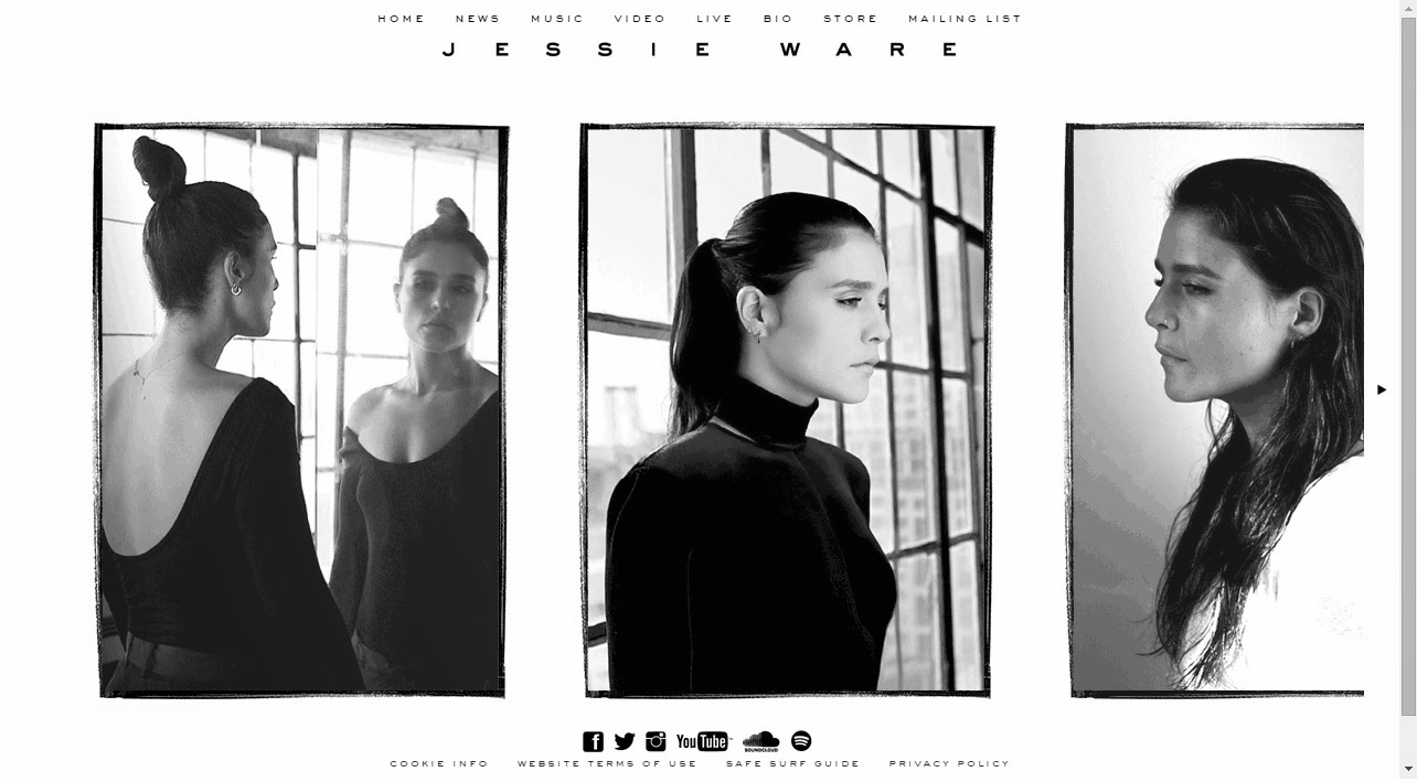
WEBSITE RESEARCH - JESSIE WARE


EDITING

This session i added the dance routine footage to our music video, i thought that these shots were really effective and looked really good when put together with the music. I found it difficult to edit this because the dance routine itself was really short and was only for one part of the chorus, it was difficult because I didnt want the shots to look too similar in different parts of the song.


Monday, 9 March 2015

WEBSITE RESEARCH- RUDIMENTAL


I decided to look at the rudimental website as it links to our genre, our genre is dance whereas their genre is drum and bass but i would say that it comes under the genre of dance so it still is our genre. i really liked the simplicity of the background and plan to use that in my website or experiment with that to see if i like it. I like how when their new song is out they change their website completely as seen above, you cannot access any other parts of the website appart from watching the song that they want to promote and a few tour dates below that as well as link to social media which promotes the artist on all media platforms and makes her accesible to everyone, there are also links to buy their new song. I think this is a really effective way to promote their song and i will use this in my website but instead of it being the whole website i plan for it to almost be like a welcome page in which views can continue on to the main website to see all the other content.


When a new single/ album has not just surfaced this is the home page of their website, again i really like the simplicity and the use of colour being very linked and the same throughout the whole website. The pages that are featured are 'News/blog', 'Live', 'Videos', 'Music' and 'Store'. The purpose for all of these pages that are featured is that they allow you to access all areas of the band weather it be news about them or when their live shows are. This sort of band do not have a star image that they want to convey so the audience are more interested in their music rather than them as people. We know this as when we enter the website the bands names and faces are not shown which shows the audience are not meant to engage with them on a personal level. This is something that i do not want to include in my website as i want the sense of a star image and i want it to be clear who the artist is and i want her fans to use to website as a way of engaging with her. I know that the website is updated often as when i took screenshots of the website for this post i decided the next day that i wanted to go back and grab a few more screenshots, when doing this i found that the website had completely been updated to being just one page to promote their new singles and have their live shows at the bottom as i talked about above. I think that the focus on their new single is effective in promoting it as fans are almost forced to buy the single as there is nothing more that they can access from the website.

This is a screenshot of one of the features on the website, there website is very simple in the sense that when you click on one tab it does not redirect you to anothe page from the website it instead just opens up a tab on top with the information for example above you can see tall the 'News/blog' stuff and when clicked on each individual artical you can view the full article i think this is really helpful for fans as they can decided by the title and description what they would like to read and then click on it for more information. Once you click on one link to another page it views the homepage in the back with a grey mask over it as if to say this is behind what you are viewing now, all the page links are then moved onto the left hand side. The style of this website is really interesting and different to other artist websites i have looked at i plan to use this interesting uniqueness in my website as i want to stand out from the rest in order to convert fans.


Sunday, 8 March 2015

WEBSITE RESEARCH- ELLIE GOULDING


When you first enter ellie gouldings website the first thing you see is promotion to her new single 'Love me like you do' this is a really effective way to promote her new single as It is the first thing that is seen which makes it the centre of the audiences attention. The are also links to buying on iTunes and spotify. There is also a link below to allow you to be redirected to the main site.


Once you are redirected to the main site you are brought to this home page, all of her social media links are at the top of her page and her name is written in big at the top of the whole webpage. The background image is an edited picture of her with a purple haze to it which matches her digipak cover, this link between them is really important so that the audience can easily identify that they are by the same artist. Below is a feed of pictures she as posted as well as news when clicked on you are redirected to the news page or if it is just a picture you can enlarge it to view it properly.

This is the biography page to her website, this provides her fans with a brief explaination of the artists life and how she got into the industry and the successes she has had. This biography however is not written by her however there are a few quotations of things she has said . There are also Links to the news page on the side but these are not the main focus of the page, there is also a advertisement to her album which when clicked on redirects you to the iTunes page so that you can buy it.

This is the news page to her website each article has a photo to go with it and when clicked on you are redirected to a full length version of the article.


This is the music page to her website, here you can view all of her singles and albums in the past and you can be redirected to buy it on iTunes or her official store.


This is the photo page to her website, you can view loads of different gallerys including her cover art from albums and singles as well as her instagram feed. When each picture is clicked on it is enlarged.

This is the store for all of her merchandise, this is a whole different website which is made by universal, it features her CD's, clothing and accessories. As well as having a sign up option where fans can Sign up to receive updates on future new merchandise  and additions to the store and special promotions/competitions, plus ticket pre-sales info, tour news and new releases/events.

Friday, 6 March 2015

WEEK 13- LAST SHOOT: DANCE ROUTINE


This is some of the footage for the dance routine, overall i thought this shoot was very successful in terms of camera movement.
We had a few problems are one of our dancers couldn't make it to the shoot, because we needed to get it filmed that day and could be rescheduled, I stepped in and quickly learned the routine, we decided that  although I have no experience in dancing as long as it looks in sync with the other dancers and in time with the music it will still look really professional. 

Thursday, 5 March 2015

STEP BY STEP AIRBRUSH

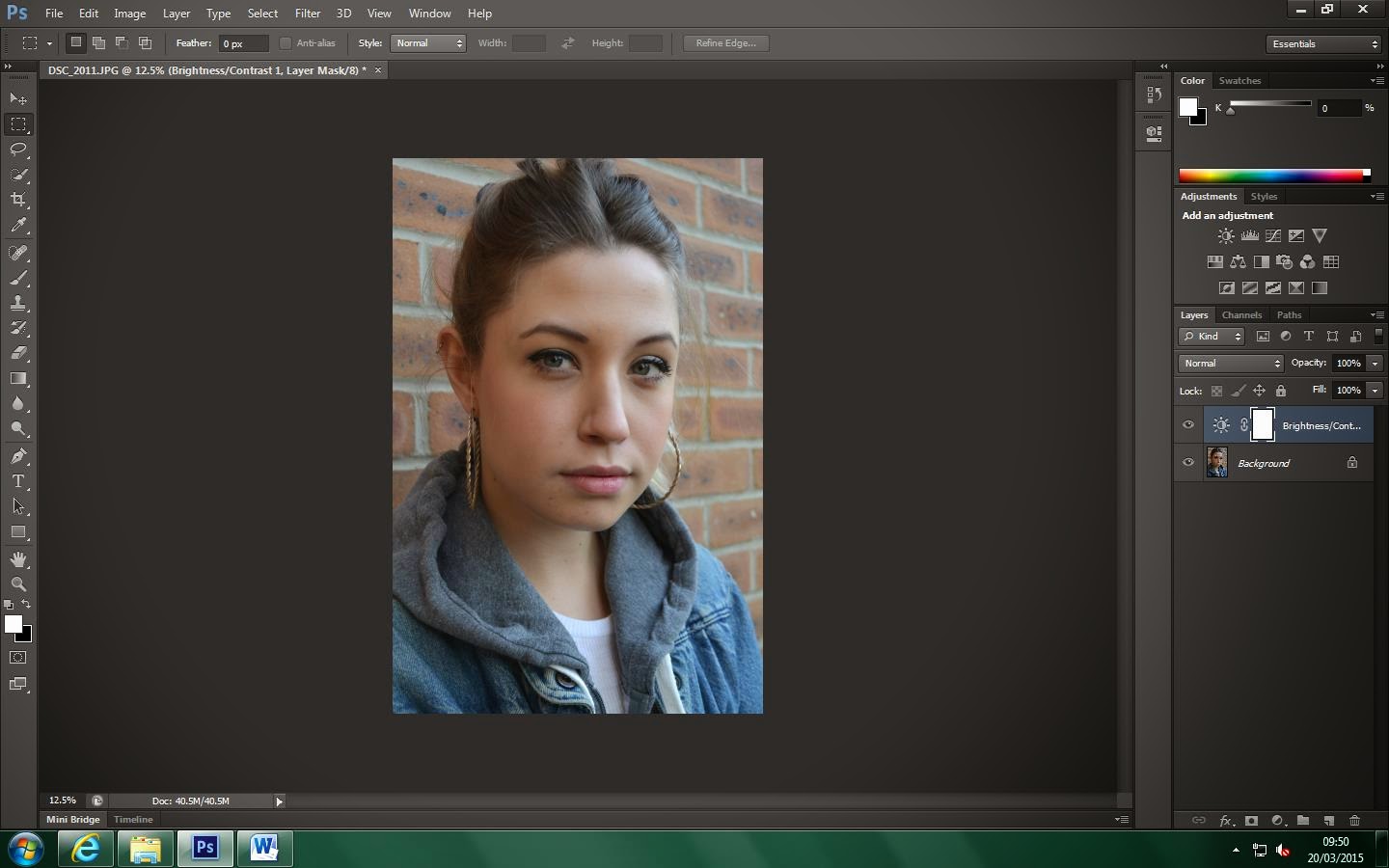
STEP ONE- I first uploaded the image onto photoshop.
STEP TWO- I then brought the brightness and contrast higher.
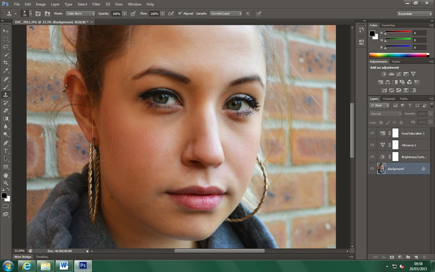
STEP THREE- I then brought the saturation up to enhance the colours.
STEP FOUR- I then increased this by also bringing up the vibrance.
STEP FIVE- I then used the spot healing brush tool to remove any spots/blemishes and wrinkles.
STEP SIX-  I then zoomed in and used the clone stamp tool to air brush her face by selecting the colour and brusing it onto her face to achieve an even smooth skin tone.
STEP SEVEN- I then blurred the background by duplicating the layer and adding a blur mask to the duplicate, I then used the rubber tool to erase the parts that i didnt want to be blurry, being the face, body and hair. This is the outcome.